Binnox - E commerce App

Overview
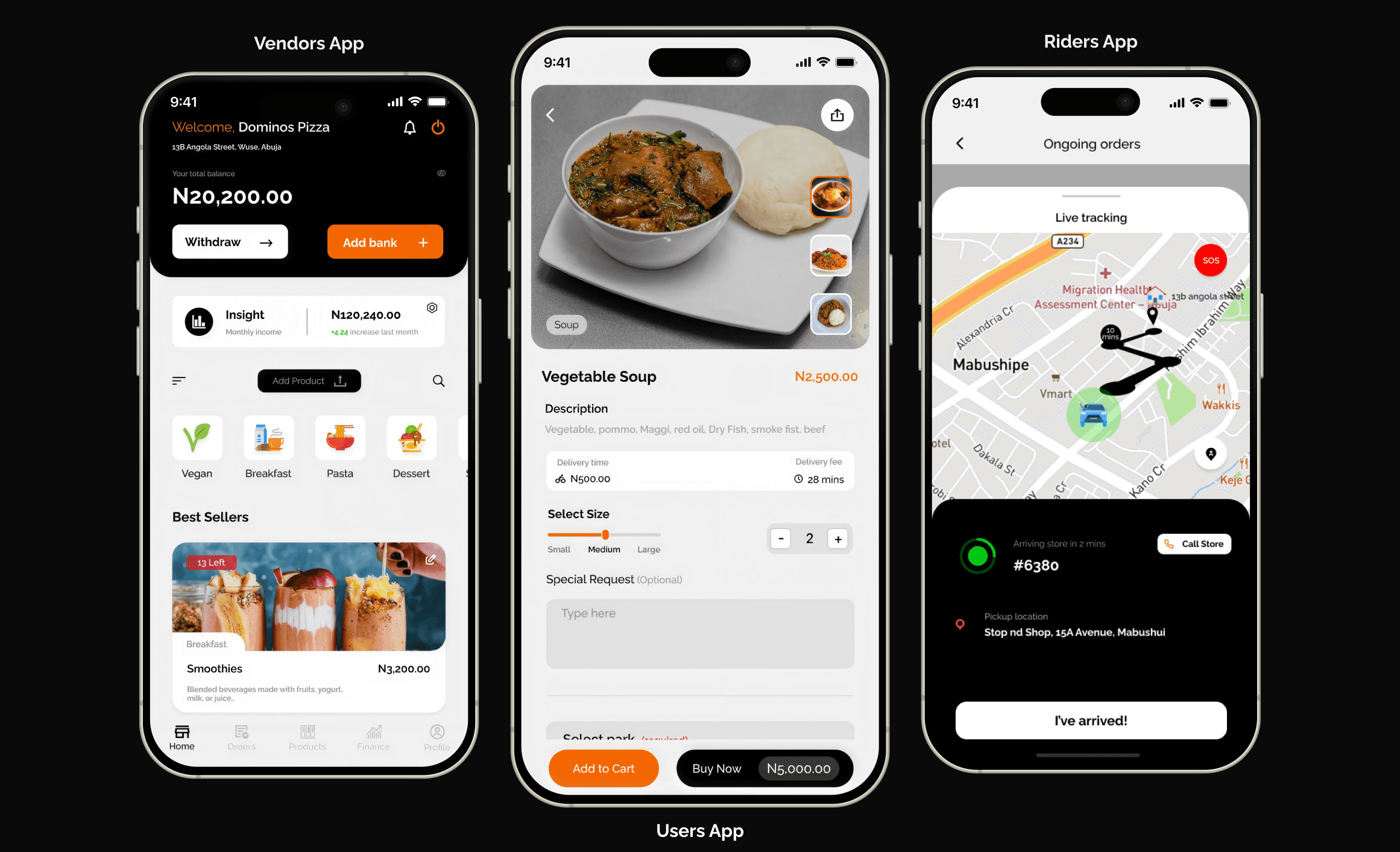
Binnox is a local commerce platform in Abuja that connects customers, businesses and delivery riders through three separate apps, one for customers to browse and order, one for vendors to run a digital storefront and manage orders, and one for riders to handle dispatch, navigation and earnings.
It launched in 2022 as a multi-category marketplace covering supermarkets, pharmacies, restaurants and local stores, on the theory that breadth would drive retention. By 2024 it had narrowed to food delivery alone. The product got smaller every year and better every year.
The problem
Local commerce in Abuja ran on phone calls, not platforms.
Customers found vendors by calling them, comparing prices by asking around, and arranging delivery through whoever was available. Vendors had almost no digital visibility and no way to manage orders beyond a phone and a notebook. Delivery was informal and unreliable on both ends.
The fragmentation was the opportunity, and it justified an ambitious answer: one platform covering everything a neighborhood buys. Restaurants, supermarkets, pharmacies, local stores. That was the bet Binnox opened with, and it was a reasonable bet at the time.
The best design work I did at Binnox was subtraction. The product got smaller every year and better every year.
EVERYTHING - MULTI CATEGORY
What we thought it was
One app for everything a neighborhood buys.
Supermarkets, pharmacies, restaurants, local stores, several consumer surfaces. The logic was network density, more categories means more reasons to open the app, which means retention, which attracts vendors, which attracts riders.
On paper the breadth was the competitive advantage. Category specialists could be outflanked by a platform that covered everything. Designing it meant building for shopping behaviours that have almost nothing in common: a weekly supermarket run, an urgent pharmacy order, and a hungry decision made in ten minutes are three different products wearing one interface.
EVIDENCE - REALITY CHECKS IN
What the market actually said
Breadth spread the product thin without making any single use case good.
Covering every category meant every category got a compromised experience. Supermarket ordering wants list building and substitutions. Pharmacy wants trust and speed. Food wants browsing and immediacy. Serving all three from one flow means serving none of them properly.
The same applied to operations. Riders trained for one delivery profile were dispatched against another. Vendor onboarding needed different tools per category. Every additional category multiplied the design surface without multiplying the users.
FOOD - ONE CATEGORY
The cut
We removed every category except food, and the product finally worked.
By 2024 Binnox was food delivery and nothing else. Supermarket went. Pharmacy went. The multi-category home screen that had been the center piece of the original thesis went with them.
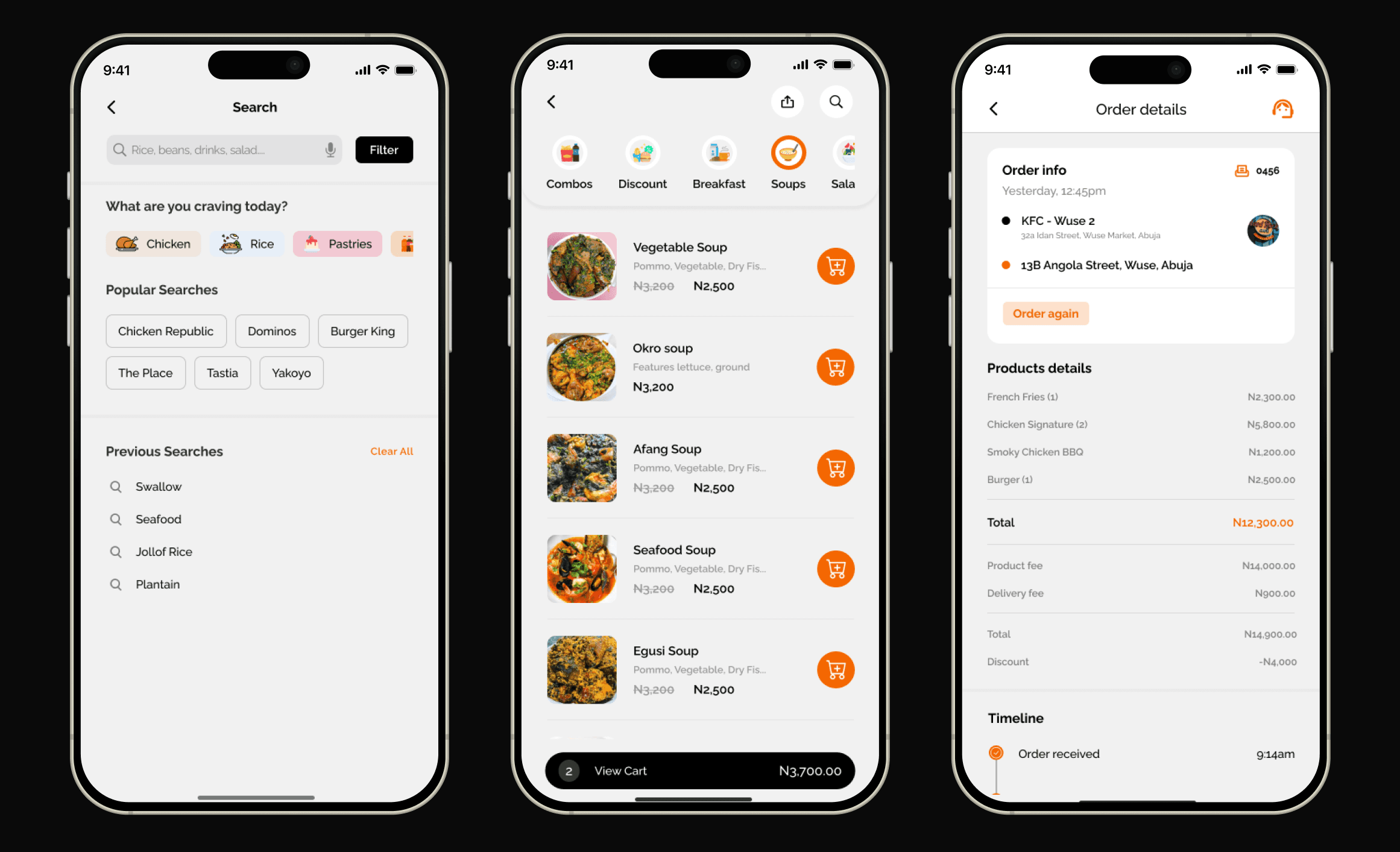
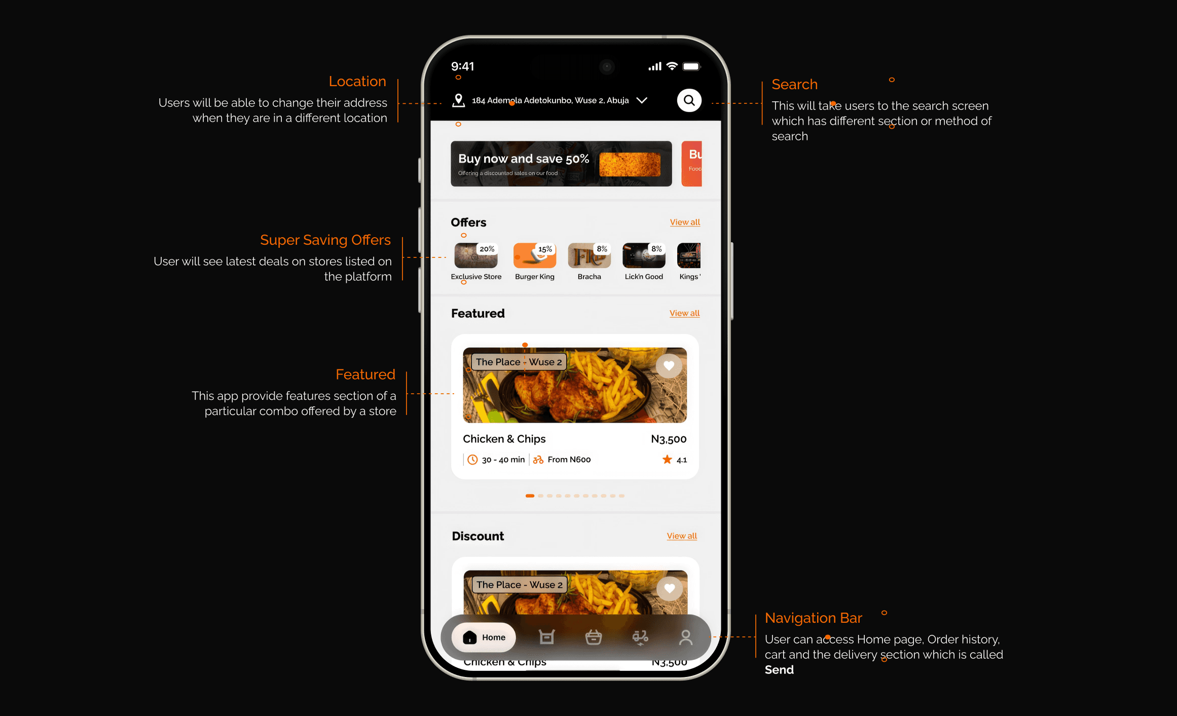
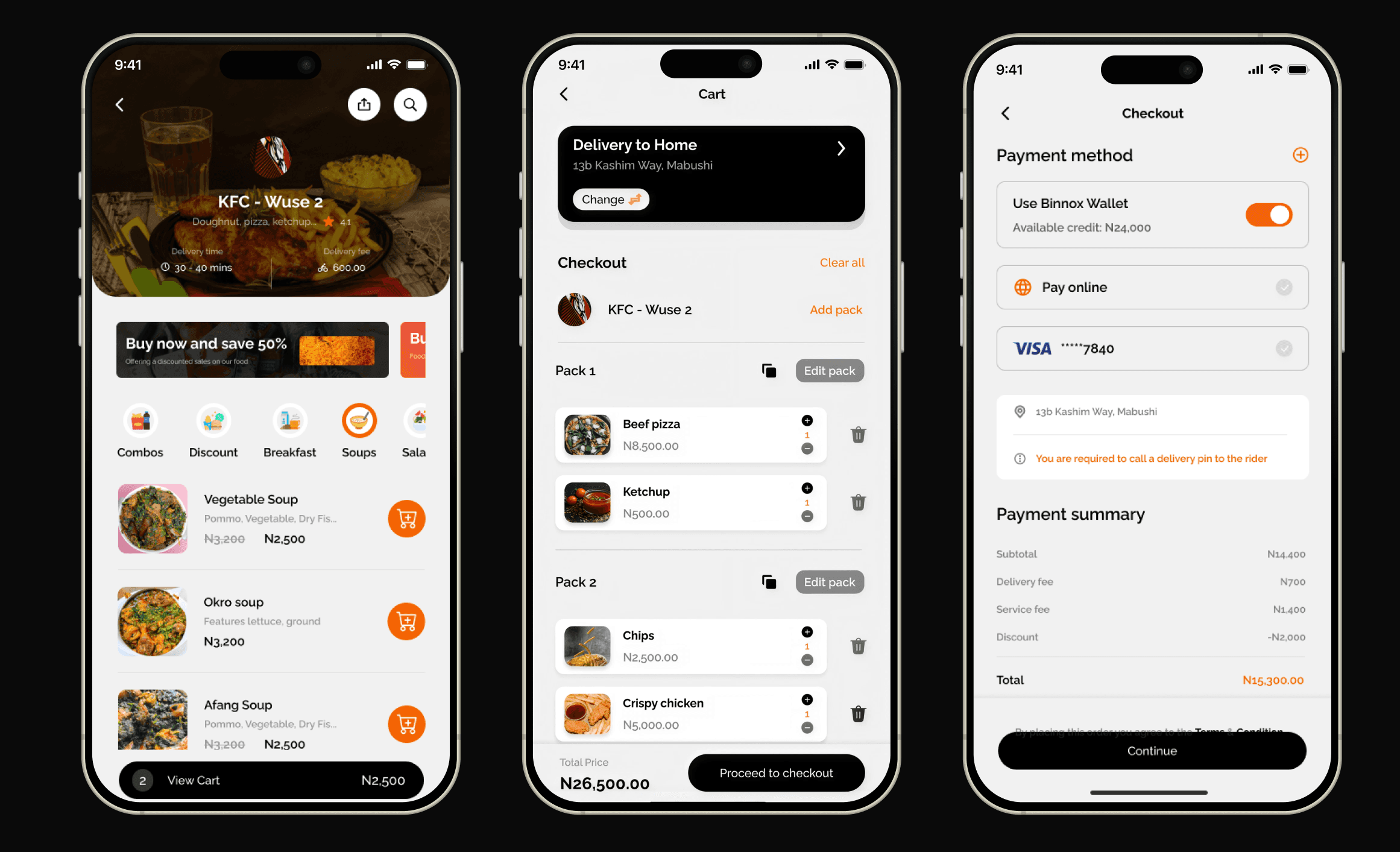
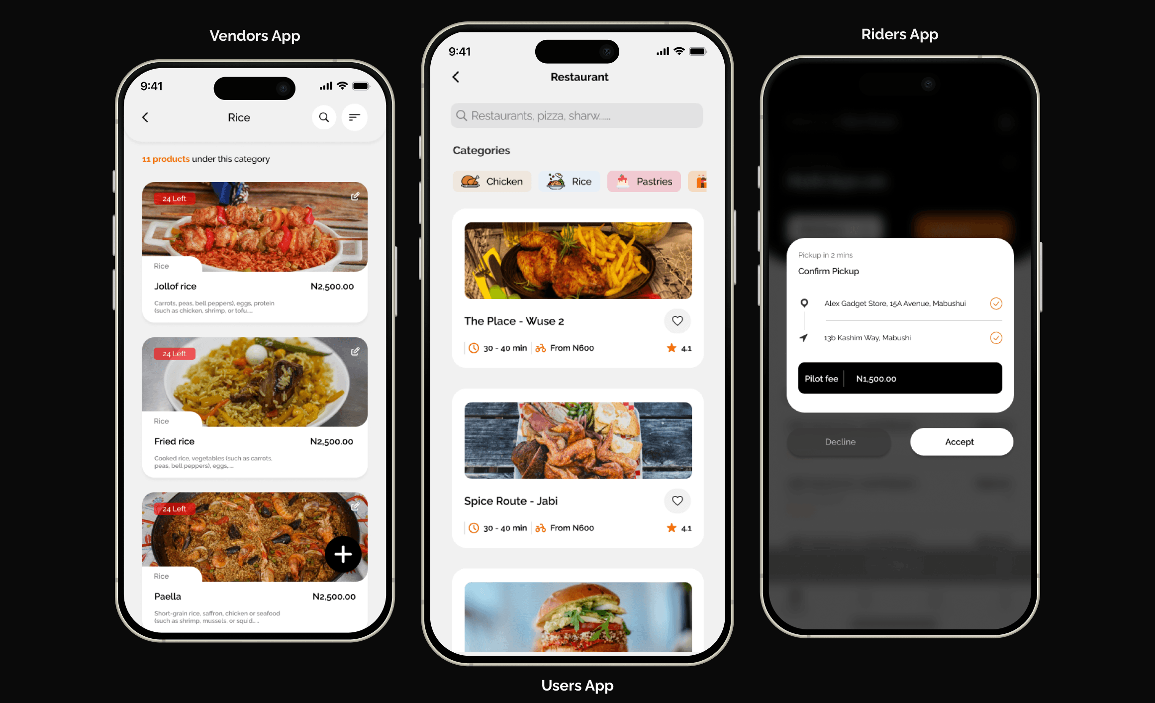
What survived was the part that had always carried its own weight: a customer app for discovery and ordering, a business app giving vendors a real storefront and order management, and a rider app for dispatch, navigation and earnings. Three surfaces, one transaction, one category, and enough focus to make each one good rather than adequate.
What got better
Three apps, one transaction, three completely different jobs.
Customer | Discovery, ordering, payment, live tracking. Wants speed and certainty about when food arrives |
Business | Storefront, inventory, order processing, analytics. Wants volume without operational chaos. |
Rider | Dispatch, navigation, earnings. Wants density and predictable pay per trip. |
These interests do not align. Faster promised delivery is better for customers and worse for riders. Lower commission wins vendors and starves the platform. Every meaningful decision in a three-sided marketplace takes from one side to give to another, and pretending otherwise produces a product that quietly fails whichever side has the least voice.
Three apps, one design language
Consistency across three products through three years of rebuilds.
Leading design here was less about any single screen than about keeping three products recognizably one platform while the scope underneath them kept changing. A customer, a vendor and a rider should feel they are using the same company, even though almost nothing about their tasks overlaps.
The three surfaces
Reflection
We took two years to learn something the first six months could have told us.
The multi-category thesis was reasonable on paper and wrong in practice, and the cost of finding that out was measured in years rather than months. What I would change is not the decision to narrow but the speed of reaching it.
The signals were available early, categories behave differently, and a single flow serving three shopping behaviours serves none of them well. That was visible in the design long before it was visible in the numbers. I now treat “this interface is being asked to do incompatible jobs” as evidence in its own right, rather than something to solve with better information architecture