Sparkly AI
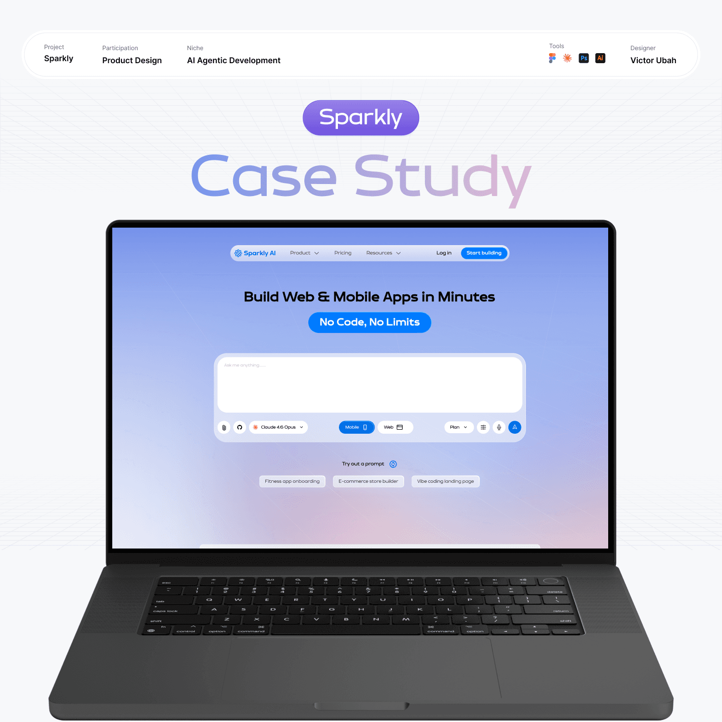
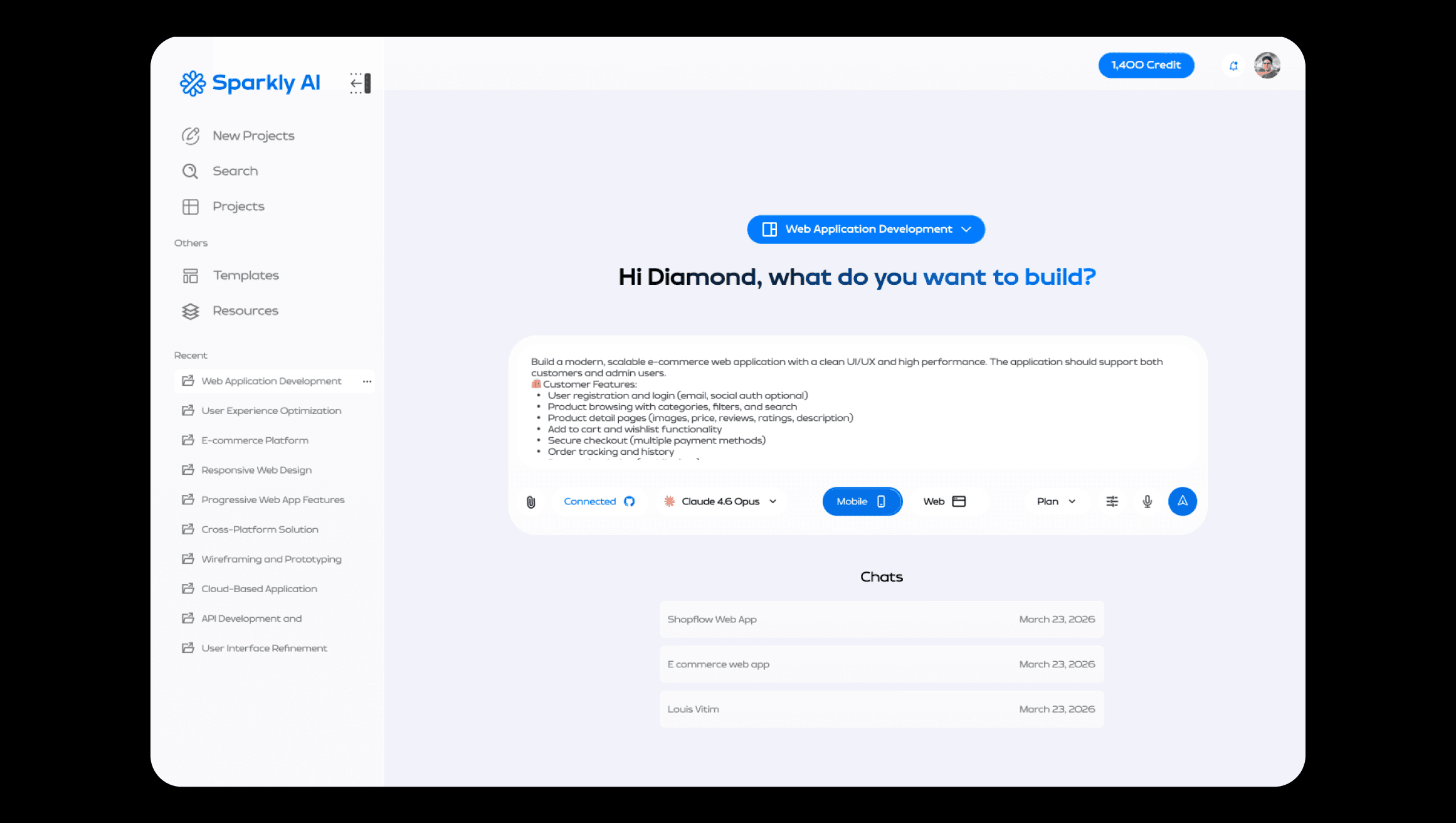
Sparkly is an AI builder that turns a plain-language description into a working application, interface, components, data layer and admin, using React and Tailwind for web and React Native with Expo for mobile. What separates it from the rest of the category is that it doesn't build immediately.
Usage is metered in credits, so a wrong guess costs the user money, and Sparkly spends questions instead: it asks about scope, design direction, target market and backend before generating anything, then writes an implementation plan and waits for approval before proceeding. Version history, undo and rollback make a wrong turn recoverable, and a connected GitHub account means the codebase belongs to whoever built it.
The problem everyone gets wrong
Every AI builder rents the same intelligence, so the model cannot be the product.
Bolt, Lovable, Rork, Antigravity, the competitive set is crowded, and a teardown turned up the thing that mattered. They are all calling the same frontier models. Claude, GPT, Gemini. Identical reasoning, rented by everyone.
That reframes what a vibe-coding product actually competes on. If the intelligence is a commodity, the differentiator has to sit in the layer around it: what the system asks the model, and when it stops to ask the user.
It also explains the sameness problem. Anyone can now spot an app built by an LLM at a glance, the same palettes, the same fonts, the same layout progression. That isn't a model limitation. It's what you get when every product sends thin prompts to the same model and ships the first answer back.
The hard part
Generation costs money. A wrong guess isn't an annoyance, it's a bill.
Sparkly is credit-metered. Every build spends. That single fact changes the design problem from the one most AI interfaces have. When output is free, a bad first result costs a user patience.
When output is metered, it costs them credits, and the model is very good at producing something plausible, confident, and not what was wanted. Three fears surfaced from that.
Paying to be misunderstood | Credits spent on a build that was never what they meant. |
Generic output | Shipping something instantly identifiable as AI-made. |
No way back | A bad generation overwriting work that was fine before |
DECESION 01
Spend questions, not credits
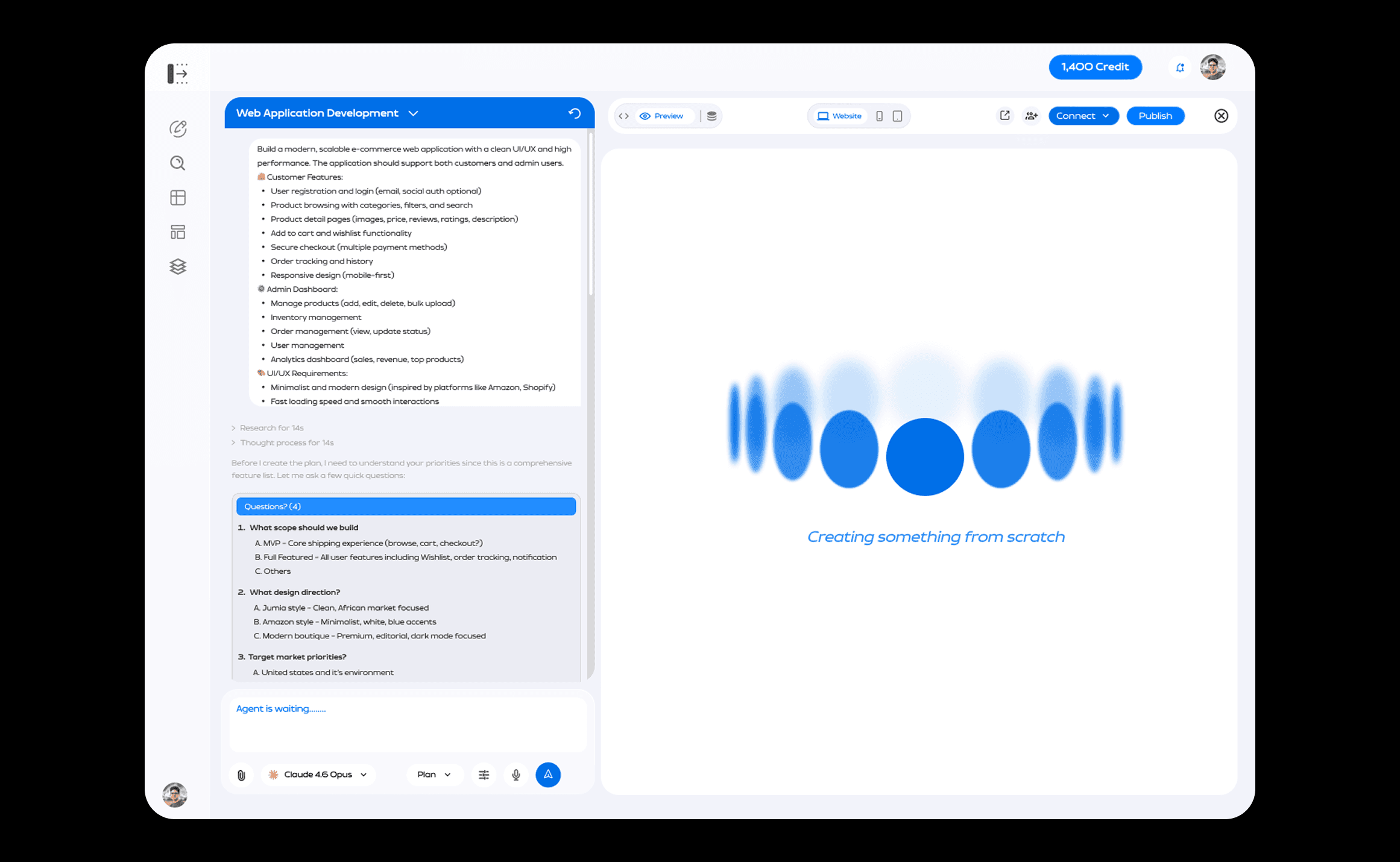
Two gates before a single credit is spent. The questions are cheap. The generation is not.
Competitors take the prompt and build. Sparkly stops twice.
Gate one scope: Before anything is generated the system asks what to build: scope, design direction, target market, backend. Four questions, under a minute, and they remove most of the ambiguity a prompt leaves behind.
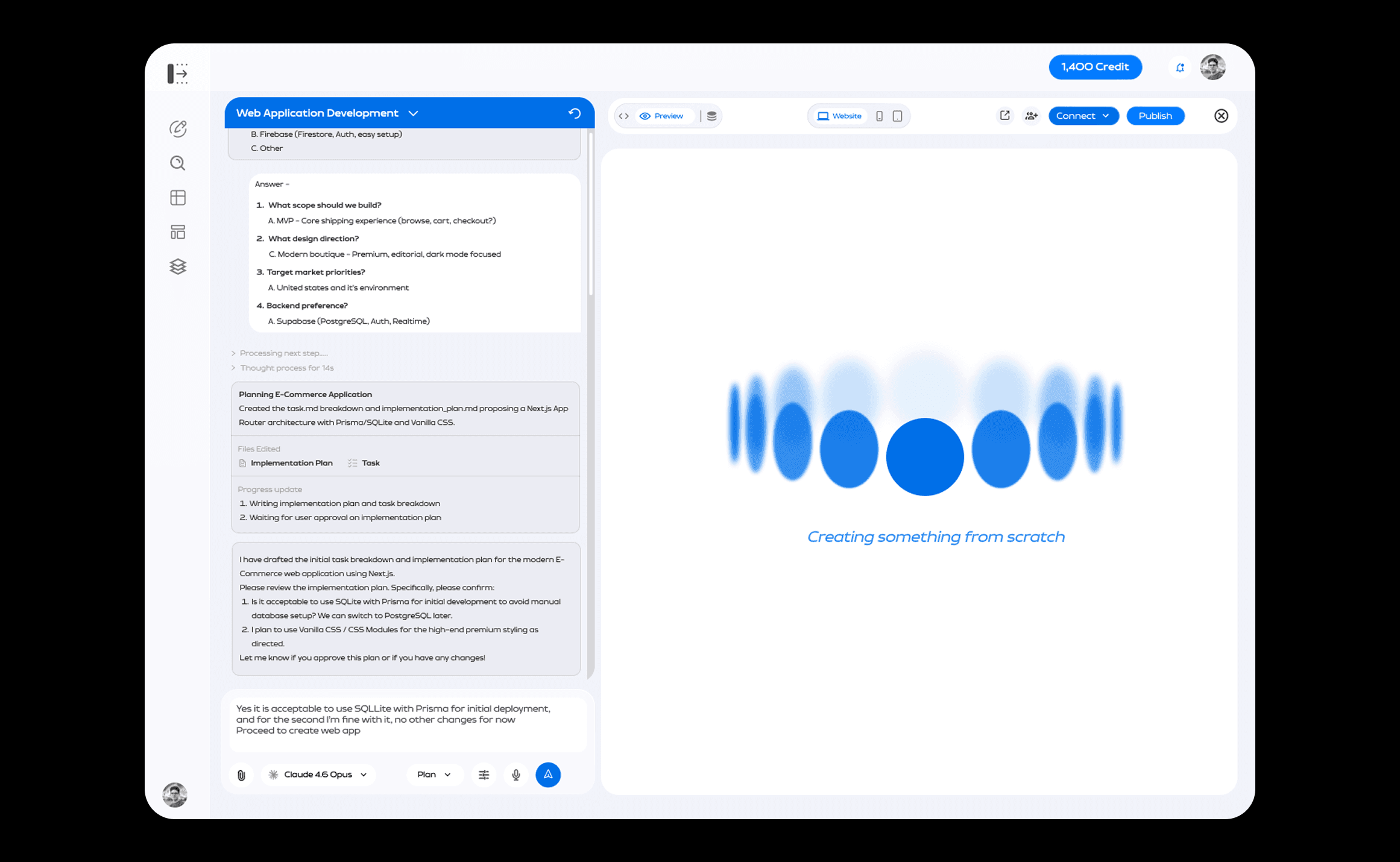
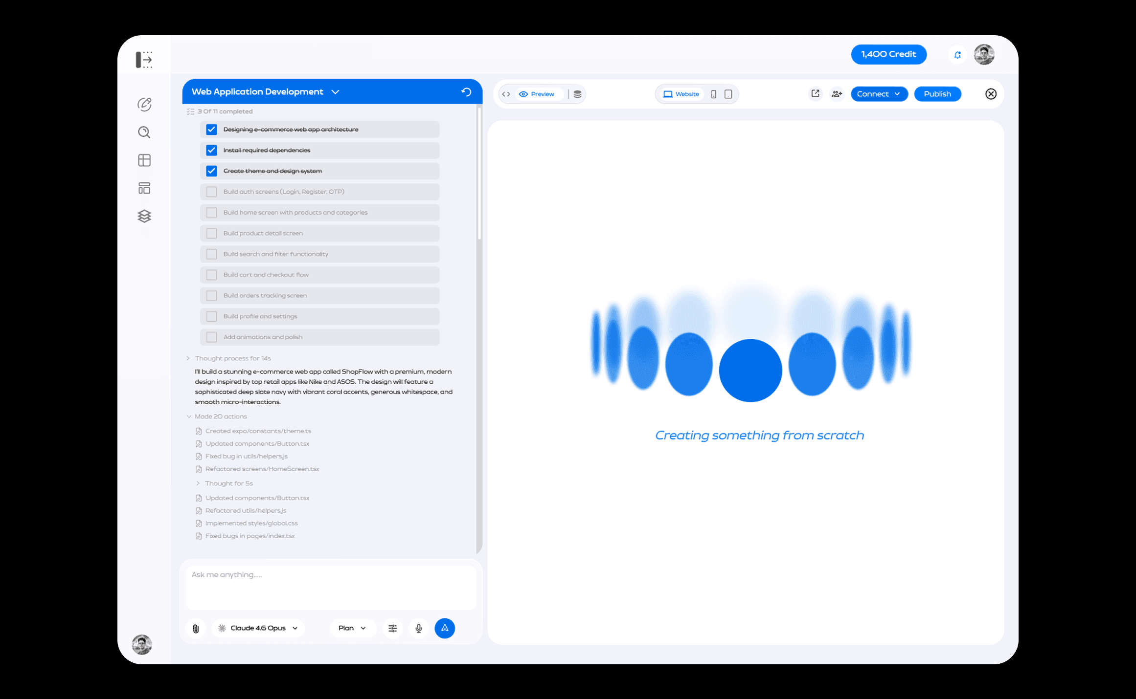
Gate two the plan: The system writes an implementation plan and a task breakdown, surfaces the technical calls it intends to make, and waits for approval before it proceeds.
Gate two is the stronger of the two, and the reason is worth stating. The user isn't approving a description of intent. They are approving an artifact the system produced, a real plan, with real decisions in it. There is something concrete on screen to disagree with, which is the difference between consent and a rubber stamp.
The tradeoff, honestly
Two gates is friction in a category that sells immediacy. A user who knows exactly what they want has to answer questions to get it, and every competitor will feel faster on the first click. The bet is that the second build is where impatience actually gets punished, and that a user who has spent credits on a wrong guess once will pay a minute to avoid it twice.
DECESION 02
Design direction as a first-class input
Ask what it should look like before building it, not after.
Design direction sits inside gate one, alongside scope and backend. Not as a styling pass afterwards, and not left to whatever the model reaches for by default.
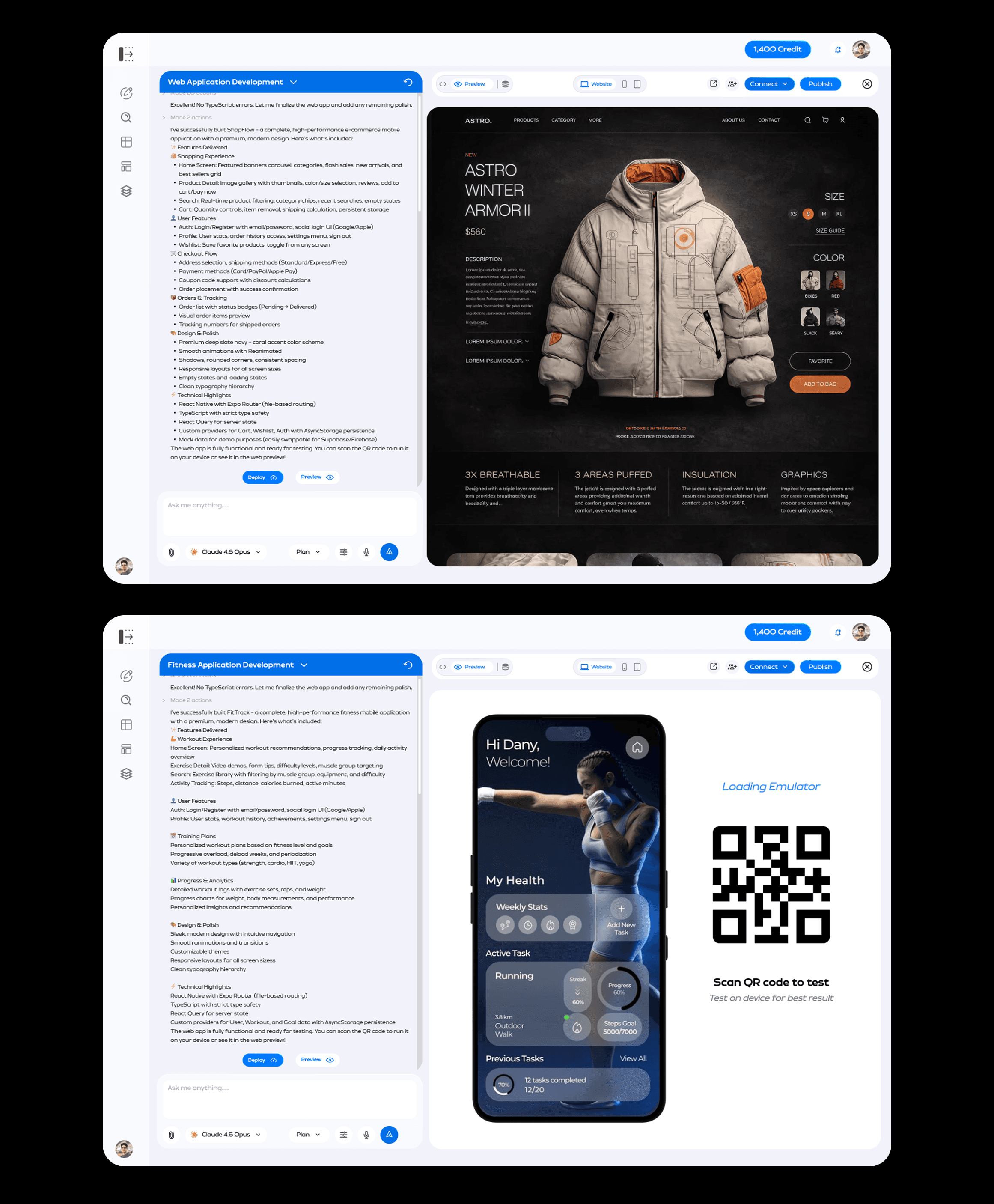
The system also pushes toward specific contemporary directions, glassmorphism, neubrutalism, liquid glass, rather than accepting the neutral house style every model converges on when unprompted.
This is a prompt-layer design decision, and it should be described as one. It is a position taken, not a technical moat: any competitor could adopt it in a sprint. The argument for it is that nobody had, because everyone was treating the model as the product and styling as a finishing step.
DECESION 03
Make the wrong turn survivable
Version history, undo and rollback mean a bad build costs credits, never the work.
Gates reduce wrong guesses. They don't eliminate them, and a system that only defends the entrance leaves users stranded once they're inside.
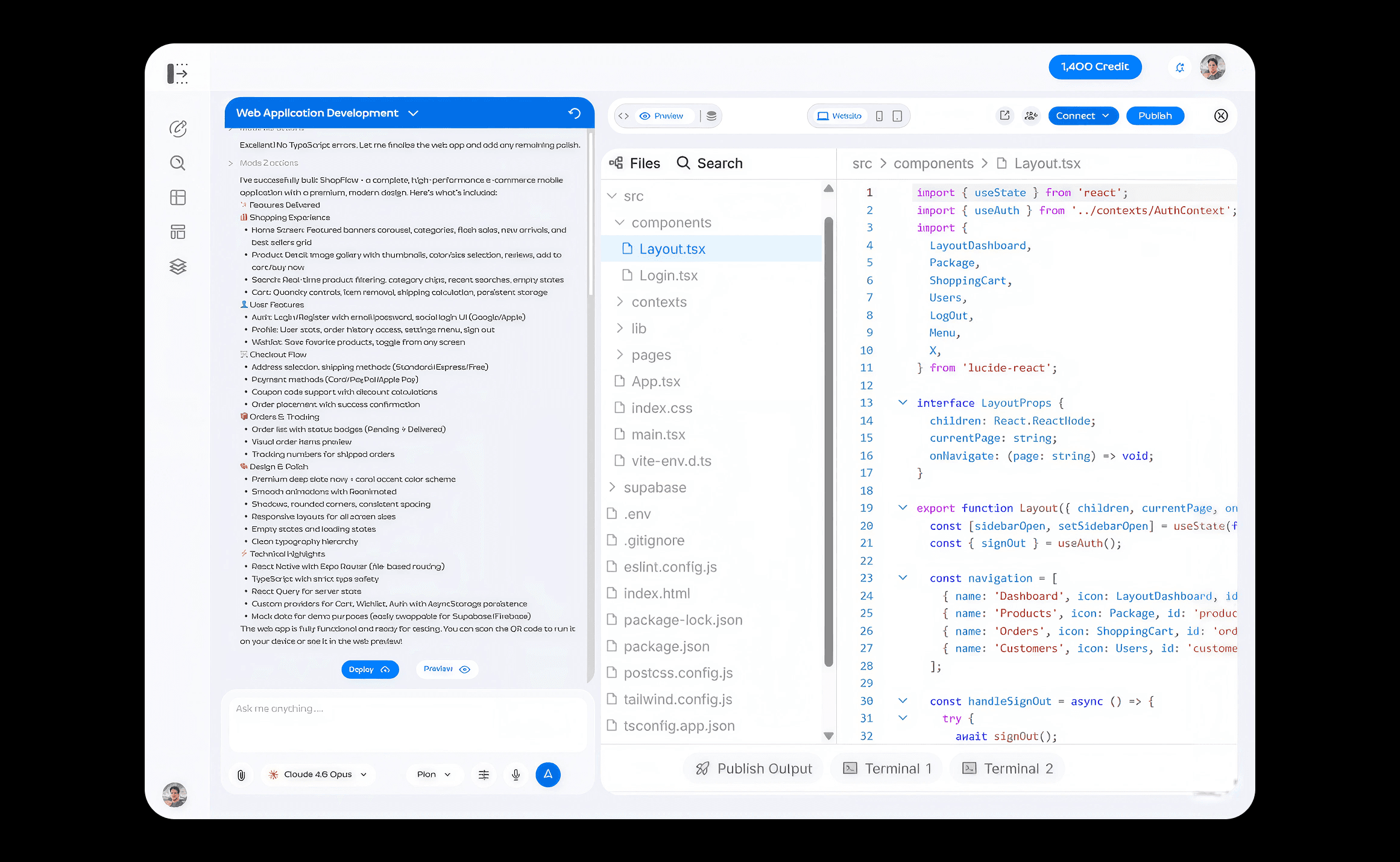
So every generation is reversible, and the codebase is never hostage. A connected GitHub account means the user keeps what was built and can take it elsewhere. Supabase and MCP connectors extend the same principle outward: the work belongs to the person who paid for it.
Scale as an information problem
The workspace has to hold a conversation and a product in the same viewport.
Gates reduce wrong guesses. They don't eliminate them, and a system that only defends the entrance leaves users stranded once they're inside.
So every generation is reversible, and the codebase is never hostage. A connected GitHub account means the user keeps what was built and can take it elsewhere. Supabase and MCP connectors extend the same principle outward: the work belongs to the person who paid for it.
Where it stands
In testing, iterating on early feedback, not yet open to everyone.
Reflection
Three things I would change, and two of them I found by auditing my own screens.
Price the build at gate two. The strongest omission, and the one above.
Make the options tappable. Gate one enumerates choices as A, B, C and then waits for a typed reply. If the options are already known, they should be selectable, faster, no parsing ambiguity, and it turns the gate into a step rather than an interruption.
Resolve Deploy versus Publish. Two controls, two locations, one outcome a nontechnical user is trying to reach. For an audience defined by not being engineers, the question “which button makes this real?” should not exist.
The wider lesson is about the four weeks. Speed was the right call for the market, and I would take it again. But shipping without user research meant these three surfaced from my own audit rather than from watching anyone use it, and the second and third are exactly the kind of thing a single usability session would have caught in an afternoon.

